Spring 2020 Editors’ Note
By Sarah Boudreau and Annie Raab
Before the world came to a physical halt and all our interactions became virtual we, the Spring 2020 editors of The New River, enjoyed the healthy balance between in-person art and digital art. Now that everything has changed, we find ourselves thankful for the chance to fully intertwine our identities with the online machine, and better equipped to hold conversations with our robot overlords through digital art and literature. We have considered this new digital reality a loaded gift, perhaps much like a can of peanuts with a spring snake inside. Although our physical meetings as a team were disrupted by the pandemic, we found ways to communicate and collaborate through the internet and overcame significant technological learning curves when required to do more than open a web browser. In some ways, the COVID-19 pandemic brought us closer to the mission of The New River, even as it pushed our meetings apart. Since the beginning, The New River has dedicated a platform to emerging and established artists working at the intersection of digital art and literature. Excellent execution has always been one of our top priorities, along with innovative ideas and user-friendly engagement. We aim to challenge passive readership—a symptom of overindulgent screen time and existential Googling. The artists we have selected for the Spring 2020 issue of The New River compliment this vision and complicate the questions “what is art?” and “who is it for?”
As digital life is now more important than ever, we are proud to present our selections for our Spring 2020 issue and some of the reasons we felt these pieces in particular deserve a visible platform. We received some of the best submissions The New River has ever seen, but could not accommodate them all. Maybe someday, in a dark future, when social distancing is mandatory and established art galleries must shut their doors to the in-person public, we will open our portal for all artists working in the messy, vibrant space between the written word and virtual reality. It is possible to see a silver lining in this dystopian present.
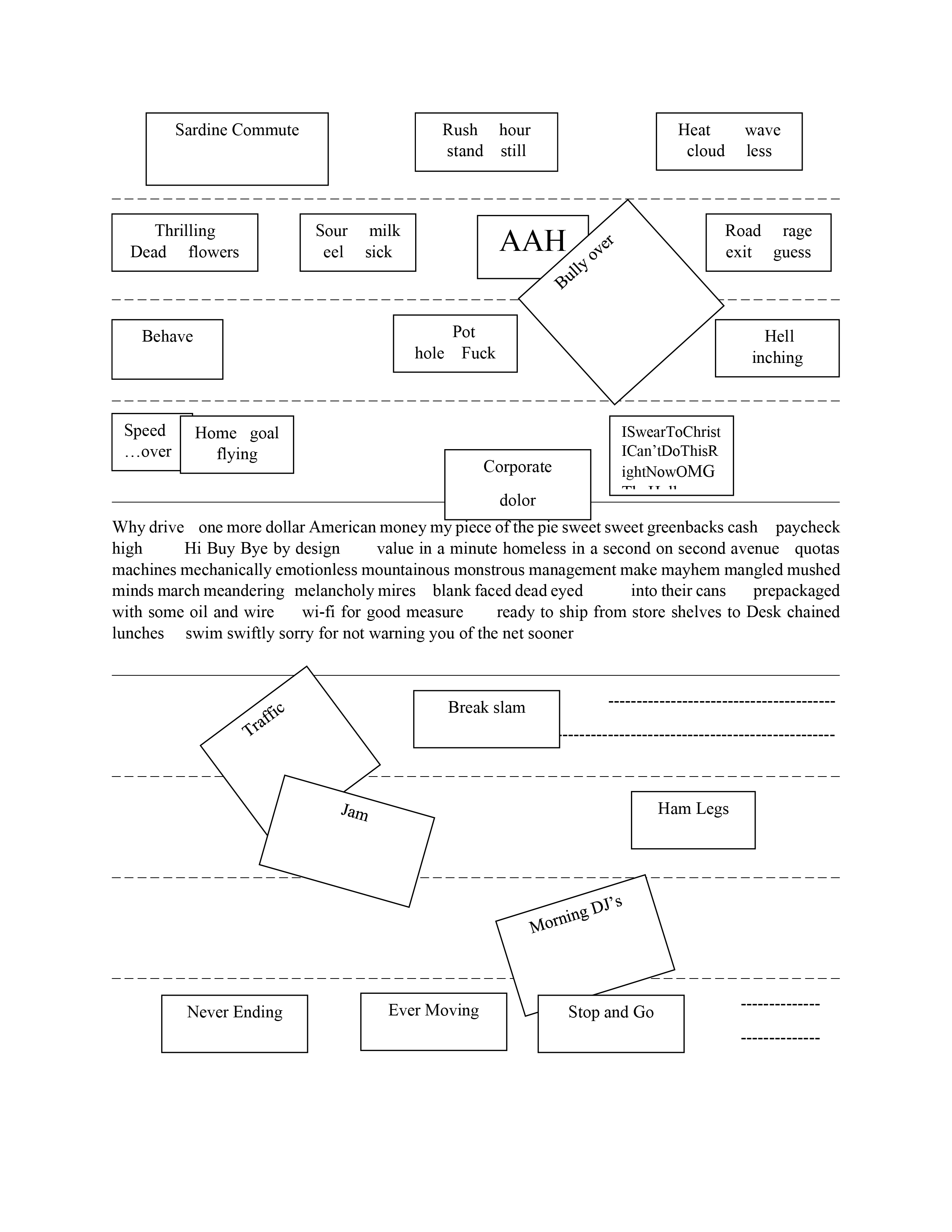
Mark Marino’s “Flight of the Code Monkeys” puts the audience in the role of a programmer who is tasked with correcting code for their robot overlords. The dystopian elements of this piece are enmeshed in daily work grumbles familiar to anyone who has sat behind a desk. Dreams of overthrowing the system permeate the narrator’s thoughts and actions, and the story builds out tension between the desire to revolt and the necessity of work. Readers control the story by selecting different commands. Marino takes a computational task many viewers might struggle to understand and narrates it from a compelling point of view. Formally, “Flight of the Code Monkeys” contains a robust narrative and polished presentation that can be read straight through or manipulated by the reader.
“Flight of the Code Monkeys” pits the user against a moral and societal dilemma: comply and do your job, or fight the oppressive regime. In his own words, Marino says “as you sweat, attending to its requests, you begin to wonder if the code you are correcting is all that benign… interactors must choose whether they will follow the dictates of the System (and more quickly reach a vacation with their love interest) or follow the Resistance and attempt to bring down the System.” This choose-your-own-adventure element gives codespeak its own radical place in capitalism. It feels very profound today.
We were drawn to Stuart Malthrop’s piece because it involves the reader in the act of excavation as we chip away at the nonsensical and reach a larger narrative. “Stromatolite” challenges passive reading by making the reader work to eliminate nonsense from the story. When exploring the piece, the viewer first sees a traditional layout for a book, complete with drop cap, but the text itself is unskimmable and almost unreadable as nonsense phrases abound. It’s the viewer’s job to click on those nonsense phrases, which disappear from the page–a graceful bowing-out of literary lorem ipsum. If the viewer clicks on a “real” line, it will stay firmly in place, and icons at the top of the page indicate how many of the twenty-one lines the viewer has discovered among the chaos of the page.
The reader can determine how much nonsense “Stromatolite” tolerates. Like Gertrude Stein or Lewis Carroll, Stuart Malthrop sees the value in interposing recognizable phrases between computer-generated gobbledygook. It is the slightly mad reader who will leave more nonsense phrases than the casual skimmer can understand. But that’s ok. We’re all mad here.
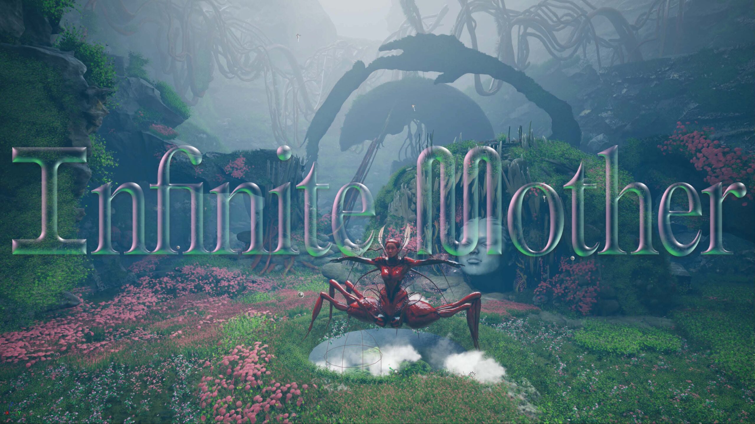
This piece originally caught our attention as it is visually striking and provides a sort of parody of the PowerPoint, asking us if oft-used learning tools are actually helping us learn anything. “Camtasia Fantasy” uses the visual vocabulary of PowerPoint presentations to play with the viewer’s visual literacies and processing of information. In a mock-lecture on sound art, Jeff Morris presents illustrations and half-readable, pixelated text that swarm the screen, constantly shifting. The “slides” move as if breathing, and the distorted, slowly-dripping sounds of a lecture are impossible to decipher. The viewer’s brain tries to make sense of the warped–and warping–slides and audio. Digital text overlays print text and images, creating layers of meaning within the presentation. By the time we glimpse the artists Yves Klein, Marcel Duchamp, and John Cage, “Camtasia Fantasy” acknowledges its hereditary link to surrealism, Dadaism, minimalism, and the sublime movements in visual art and sound. Through teasing our brain’s processing systems, “Camtasia Fantasy” delivers a lecture on questioning, learning, and decipherability.
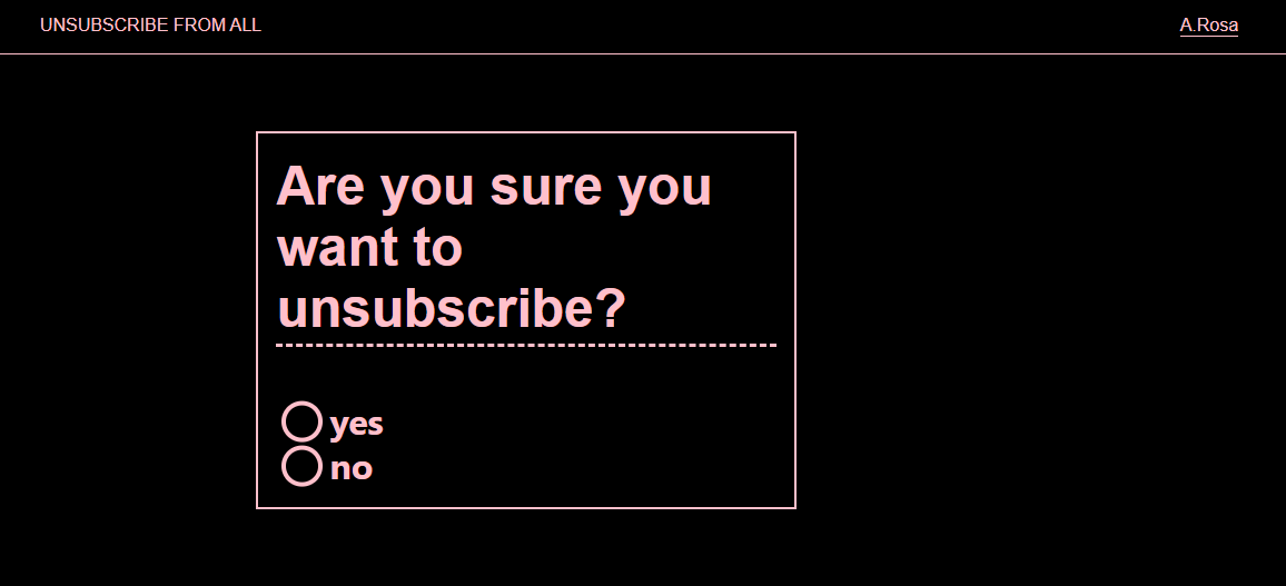
Alex Saum-Pascual cleverly manipulates the Google Form function to mimic the choose-your-own-adventure format familiar to friends of hypertext. The responses are poetic and melancholy, as the form asks the viewer to choose options from a list. Gradually, characters emerge: a child and a father. Questions are not posed as questions, but as poetic musings whose answers add more mystery than clarity. In this way, we piece together a poem through a series of sensitive observations about color, touch, and meaning: “If animals could be any color — let’s say — like flowers, birds would all fly in pastels. Children, well, children are electrical, that sort of piercing blue.”
Saum-Pascual says of “Room #1” and “Room #2”: “They are part of an ongoing series called corporate poetry which is an exploration into how corporate language (through its many standardized forms) captures and relates to the other corpora that is our bodies.” At the end, the reader is presented with the option to see all previous responses to the literature, which reduces the experience and literary elements to bar graphs and pie charts and percent signs. It is, indeed, a corporatized way to present the art and meaning of poetry.
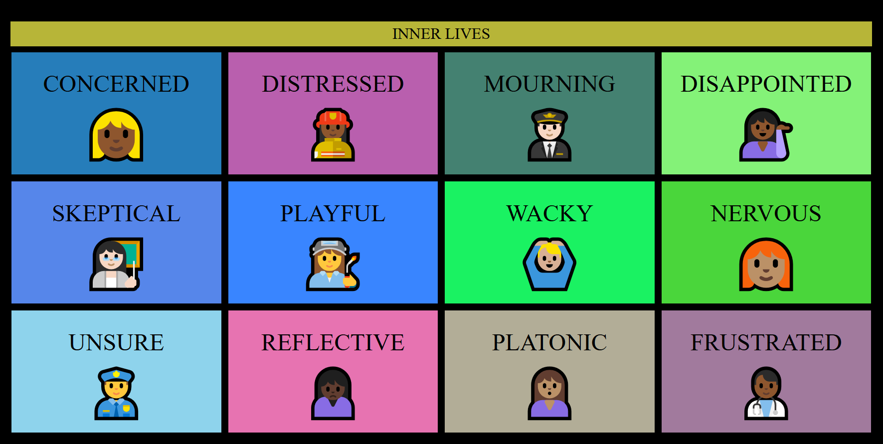
Lai-Tze Fan and Nick Montfort’s ever-changing “Dial” evokes seasonal shifts through complimentary use of soft hues and keyboard emojis. In it, two dialogue boxes flash brief words, phrases, and emojis, “talking” to each other through their juxtapositions in “both a dialogue and a representation of monologue over time.” The boxes blink messages back and forth, showing the progression of time, and the viewer interacts with the gently unfolding poem by altering the time via the dials at the bottom of the screen.
“Dial” is all the more relevant during these times of great isolation—the creators describe it as “representing networked, distant communication.” One cannot help but to think of the state of many of us this spring as our social, professional, and creative lives have shifted almost entirely online. We are confined to our box-like houses, sending messages over the Internet to each other in dialogue and in monologue.
Andrew Demirjian and James Proctor’s “Color Yourself Inspired™” generates combinations of Benjamin Moore paint names based on the names of the swatches themselves, not the synchrony of the colors. The color names are represented visually and sonically with blooms of overlapping colors and notes. Through the hypnotic cycles of color combinations, the piece evokes a sense of synesthesia as the words seemingly generate color, shape, and sound at the same time. The viewer stumbles upon delicious, evocative phrases that are small stories unto themselves: “Mardi Gras night train,” “grandma’s sweater glowing apricot red.”
While it may be easy to get lost in the pleasant, occasionally discordant colors and sounds, the cheeky trademark symbol in the piece’s title reminds the viewer that each cute color name was produced by a slew of marketing experts at a large company. Though the random color/sound/name combinations seem whimsical and organic, they still retain a level of artificiality and marketability. Not even colors are safe from capitalism.
Memorias Construidas (Constructed Memories)
Inspired by Panamanian Mola textiles and her childhood in Miami’s multicultural melting pot, Vanessa Argueta was our top pick of the visual art pieces we saw for this issue. Argueta gathers found materials and fabrics and weaves, quilts, and sews scraps into rich, busy tapestries. She then converts the objects into files for computer manipulation, pushing the boundary between traditional craft and digital media. As she translates the material, the work enjoys nuanced changes in meaning and message. While the visual art format may not be as interactive between artist and reader, an illuminating conversation between tradition and avant-garde is present on the screen. Colorful fractals and glitchy shapes capture audience attention through the use of bold colors, bright contrasts, and exceptional craftwork.
Liliana Vasques has harnessed the lighthearted GIF format to illuminate the darkest corners of gender and class inequity. Women’s names flash on the screen as the reader clicks through, accompanied by other words in English, Spanish, and Portuguese. These are not randomly generated, nor are they meaningless. These are the names of 27 Portuguese woman who were killed in domestic violence assaults in 2015. Code-switching ramps up the tension between language and story, as the reader need not understand both languages to absorb context and narrative. English words such as “fancy” or “handsome” contribute to an ominous atmosphere of doomed domesticity. Other words add clues to the vignettes: “braz” for arm, “noguiera” for walnut, “louro” for blond.
Vasques’s “Objects” succeeds as a piece of digital literature because the story is propelled forward by the reader, but ultimately restrained by the digital program. Information is withheld from the reader, and we are encouraged to sit with our growing discomfort as we consider what parts of the story have been omitted.
In “Here Comes Her Man,” Logan K. Young “regen~d~erates” the lyrics to The Velvet Underground’s “Here Comes My Man.” He uses Nick Montfort’s Curveship JS to swap around the narrator, characters, pronouns, and even the sequence of lines itself, breaking the original lyrics into pieces and rearranging them in a way reminiscent of collage. The remixed narrative is presented in GIF form as the letters dance across the screen. The consistent timing of each line’s presentation gives the piece a sense of rhythm that reflect its roots in The Velvet Underground song.
We were initially drawn to the retro aesthetic of “Here Comes Her Man,” as the blocky pixels and bright, flashing letters indeed look like something out of the early 80’s. The piece is a captivating mix of the old and the new: old lyrics spun with new vigor, the product of a new narrative system told through an old programming language. Even the details within the narrative have been updated, with the price of heroin adjusted for inflation.
We hope you enjoy this issue as much as we have enjoyed selecting and curating the pieces this season. The New River is happy to support art and literature that can be enjoyed from a safe, socially responsible distance!

